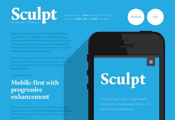
A lightweight HTML, CSS and SASS responsive framework that has been designed to gratify all devices with small screen sizes in the first place and then moving on to more complexity being added via different media queries as the size of the screen increases. Mobile First Framework
This framework by Heart Internet is available for free and one need not provide attribution to use this. The main goal behind the development of Sculpt framework is that everybody should be benefitted from Mobile Traffic and should be able to build beautiful websites regardless of the size of the screen.
This framework is meant particularly for small screen mobile devices so that you can concentrate on the core information that is needed in small screen sizes with extra complex layouts introduced as the size of the mobile screen goes up.
Core Features of Sculpt include:
- This framework has been designed keeping in mind the legacy web browsers. In order to add media query support in Internet Explorer 8 it requires usage of polyfill whereas with Sculpt JavaScript now even the older version of web browsers can make use of the novel methods and achieve supreme level of success. Though it might not be perfect but yeah it is very close. You can always ensure degree of usability for the reason that users who have IE8 and no JavaScript support will now be able to view the mobile version of your website.
- With Sculpt framework in place you can develop clean and semantic code as this JavaScript allows you to keep your webpage free from all sorts of inline styles by making use of a library that is free from CSS declarations. For instance if you want something like a container then give it the class container. All the styles in this script are named completely and logically so as to avoid any kind of naming confusion.
- Sculpt framework is a big fat typographic heart with style sheets based on twenty pixel typographic baseline. All the lists, headlines and paragraphs are designed over this baseline and thus everything will be lined up in a systematic way when using sculpt. Sculpt has style sheets which make use of cutting edge technologies so as to make sure when you choose italic or bold you are actually getting italic and bold.
- This framework has the flexibility of SASS and Robustness of CSS. This framework is highly powerful if you include the .scss variable and style sheets and forms a strong foundation for any website.
So what are you waiting for if you want to build beautiful websites then download Sculpt for free today from here.