If you want to dive into the world of novel technologies for Website design in that case CSS3 Frameworks are worth considering and highly helpful. The CSS2 Frameworks have been tested, tried and proven to be highly helpful for all the web developers. In fact there is no end to these CSS3 Frameworks as one can at all time make these better however the fact that the CSS3 Frameworks make a good starting point for website design remain true to a greater extent.
Responsive Web Design is really very cool thing and grabs the attention of more number of visitors and to achieve the challenge of Responsive Design we have the top CSS3 frameworks to the rescue of the Web Developers. With the help of CSS3 Frameworks one can get rid of writing the basic CSS styles and ease their task of website development. The one more amazing feature that the CSS3 frameworks posses is that they have a responsive layout that will help in the creation of mobile specific websites more rapidly and easily.
Here is a glance at the top notch CSS3 Frameworks that are ruling the CSS3 Frameworks Hit List
HTML 5 Boiler Plate
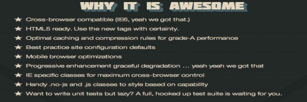
HTML5 Boiler Plate framework is compatible with cross browsers and is HTML5 ready to use with print stylesheets. This framework provides custom install setup so that one can make use of things that they want in their “Boilerplate”. If you are lazy to write unit tests then definitely HTML 5Boilerplate framework must be your choice as it has a complete suite of Units tests for you.
Golden Grid System
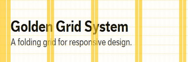
This is a folding grid CSS3 framework for responsive web design which will divide the screen into eighteen even columns with the rightmost and leftmost columns being used as the outer margins of the grid therefore you have a total of sixteen c9lumsn for design which can be altered accordingly as per the needs. For instance the 16 column can be folded to four columns to fit the mobile sized screens and into eight columns to fit the tablet sized screens and accordingly. Hence this CSS3 framework is compatible of covering any screen sizes ranging from as high as 2560 pixels to as low as 240 pixels.
Semantic Grid System

This CSS3 Frameworks is regarded as the Page Layout for Tomorrow as it has made the life of web designers much simpler. With this CSS3 framework it is easy to switch between percentages and pixels, set the required number of columns and gutter widths and all this is without the use of any .grid classes in your markup code.
Less Framework 4
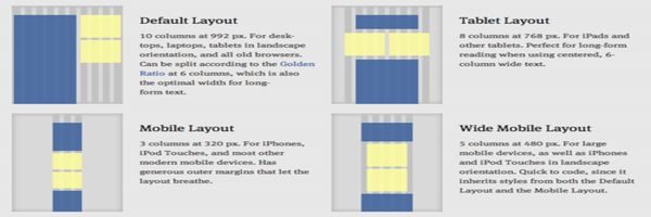
This CSS3 framework is widely used in the design of adaptive websites. This framework consists of four layouts namely Default Layout, Wide Mobile Layout, Mobile Layout, Tablet Layout and three sets of typography presets that are all based on a single grid that is made up of 68PX columns and 24 PX gutters.
Foundation

This is the most responsive front end CSS3 framework that provides you various tools so that you can quickly customize the design as per your requirements and build them in top of your foundation. It is twelve column future friendly CSS3 framework that consists of several styles and elements that will help you quickly combine all the prototypes so that you can style and adapt them into polished production code.
MQ Framework
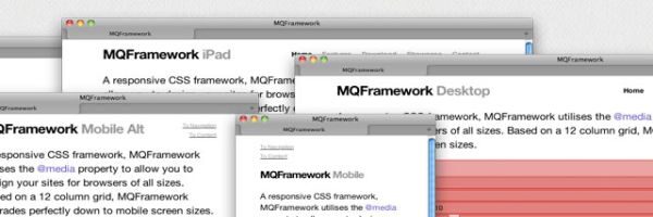
This framework is also based on twelve column grid and is structured for meeting the variant needs of the designers from fitting into a new project or into an already existing project with just minute changes to the code. This CSS3 framework makes use of the @ Media Property that will help you design your websites such that they are compatible with browsers of all sizes.
The Goldilocks CSS3 Framework
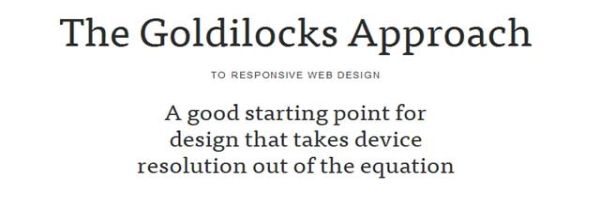
This CSS3 framework makes use a mix and match of various Pattern Translations, Media Queries, Ems, Max Width components for making your web design independent of the resolution.
Amazium
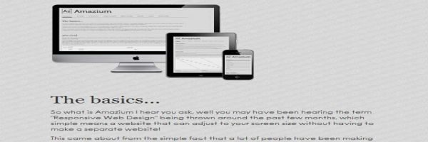
Just as the name of this CSS3 framework signifies this is an amazing responsive CSS3 framework that is created from the 960 grid system having twelve columns.