We know from experience that successful web sites create a great first impression, should be easy to use, and must guide visitors to their goals through their informative content.
Websites success many times depends on how well designed the User Interface and navigation structure is. There are many exciting Web Applications available which have User Interface design with attractive appearance and which has a good user experience too. Also, well organized user interfaces with user friendly and vibrant designs attract more attention of the users.
Here is a list of best 25 User Interfaces that allows you to access, redefine, and create a well designed User Interface.
1. Invoicera
Invoicera has more use of the label (Tabs) user interface design pattern which can effectively save web space. UI elements and its user friendly design is also very simple to use, whether the layout of UI or color with a very refreshing feel.
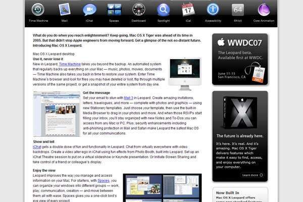
Apple is the best example of striking the balance of simplicity (white space, strong type) with rich imagery sensitively-applied. It’s also a big, varied, constantly-new site with loads of content, which always feels easy & enjoyable to navigate.
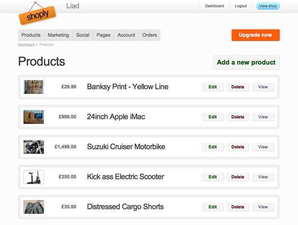
The graphical user interface design of shoply is user friendly ,simple and clear and easy to use, you can very easily edit, view, delete the uploaded product, and you can upload your new products with ease.
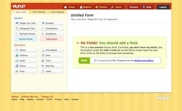
Wufoo is a web form generator; it can provide a free version for trial. It’s a form generator intuitive. Its user-friendly design is the route to go and you can conduct related operations and it also displays some help and tips, this is a very user-friendly.
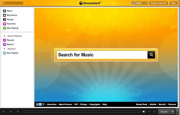
Grooveshark is an icon-based navigation UI design, user-friendly design of this website gives you a lesson that: in the use of icons, similar to the play (Play) and Skip (Skip), etc. This is not an icon known all need to text notes, and as some unique features, such as collection, home and other related text comments you need to.
Wridea also uses an user friendly user interface design, here you can click to make the appropriate editing, the use of a number of unique floating menu, only when the mouse moves in the past will show that the design saves space, while the UI design also offers two color options available.
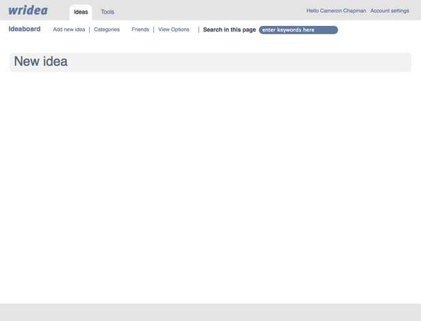
The use of a number of design elements like buttons makes the user interface more intuitive and attractive to its visitors.
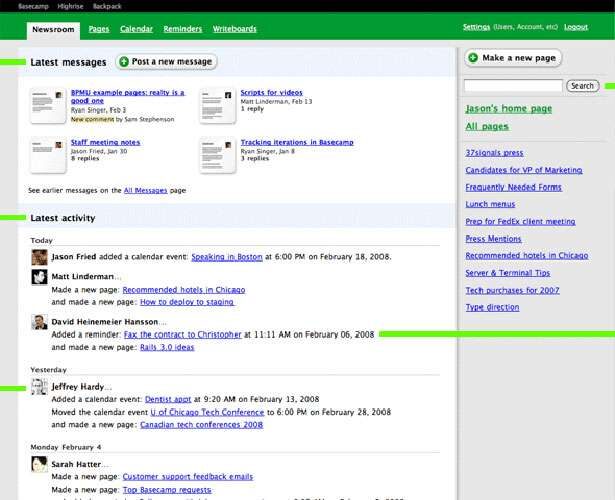
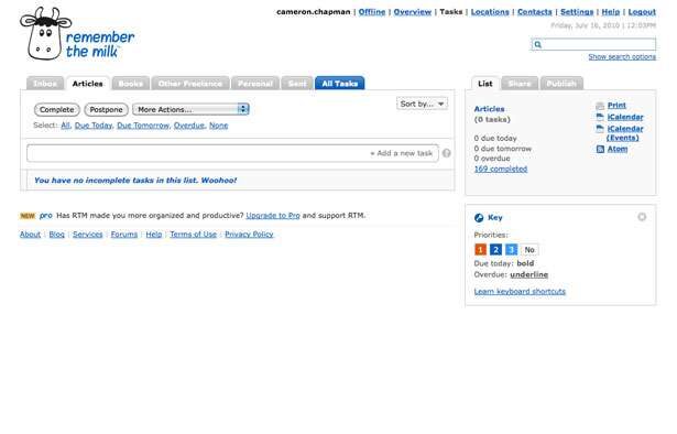
Remember the Milk is more to the UI-based label design, and its provides helpful tips from time to time, make you feel alone with the help of the document no longer necessary.
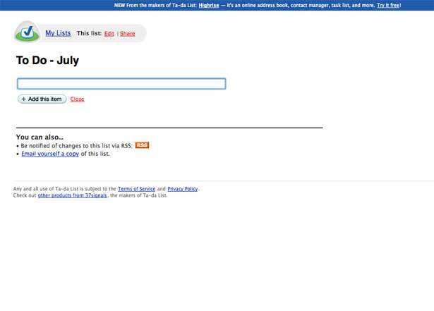
Ta-da Lists of the UI design is very user friendly, simple, there is no useless extra information, only a task for you to fill out the form, it is intuitive and its user experience is also good.
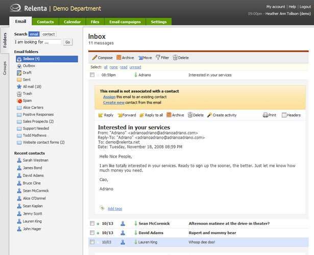
The user interface design of Relenta tabs, icons and text annotation of a combination of UI design patterns that are used by many web applications, which shows classic Department. UI design because of its e-mail interface using “custom”, so users can immediately get started without further study. So in the design of UI, it should be properly known by all UI design elements.
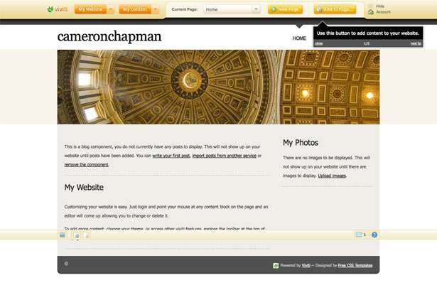
Viviti includes the clear and simple user interface design and also it provides helpful hints everywhere and also planning to help clear the document, the user can easily know how to do that in the course of the operation, the user can clearly understand what they are doing and will experience a great usability.
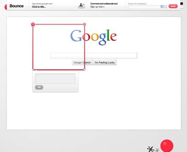
Bounce is a fun site to share views on the gadget, its graphical user interface is very simple and easy to use and is very intuitive, because the functioning itself is very simple, you just need to pull out a region in the target site, you can add comments, feedback, and perform sharing.
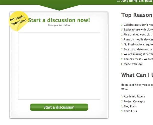
DoingText is a fast line down ideas, it discusses the topic of a small tool that can be used without registration, but also provides the right help tips and help document and provides form of a simple URL.
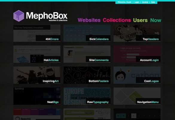
MephoBox provides various interface patterns and designs that shows the different trends within them. Their main motive is to inspire the designers and also allows them to conceive a greater design then they had first planned out to make. You can even vote on designs and also you can leave insightful comments on various designs. You can also search and sort results in a well organized way allowing you to easily find just what you required.
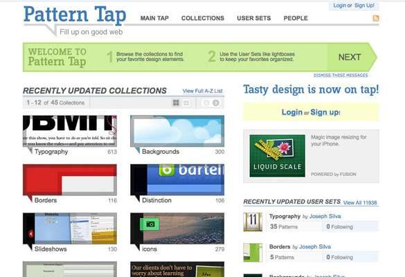
PatternTap is one of the most attractive user interface pattern design created and developed by Matthew Smith and Chris Pollock. Pattern Tap can be described as a large gallery containing amazing and intuitive web-based User Interface designs. Pattern Tap also allows its users to upload their own patterns into their library, adding to the now over 7,500 UI patterns available on the site.
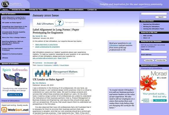
UXmatters is a very informative web magazine created to bring valuable and useful information for user experience. You can also find various design patterns within the publications that will help you to understand what’s is required from a usable and accessible user interface design. There are also various methods that will give you the insight and helps you to develop much better skills.
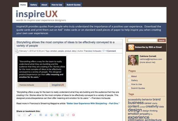
InspireUX is definitely more than just a great source for User Interface Design but also it also has numerous inspirational quotations from the top leaders in the technological community. The User Experience quotes are from experienced and famous leaders in the industry, you can find quotes from Bill Gates and more.
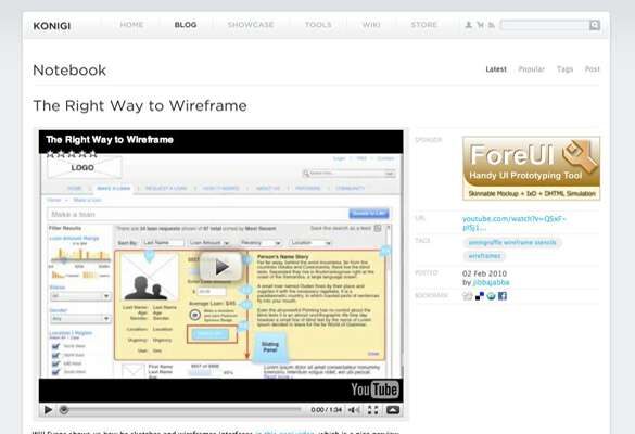
Konigi provides the design community with treasured tips, tools and useful techniques that will help you to become a much better User interface designer. Koingi is also about demonstrating the idea to give users what they expect and think they want, but more importantly it is to give them what they need and might not be able to express to others. They regularly monitor all of the leading designers and applications that are developed to produce quality user experiences and then they publicize these results for the their design community to read.
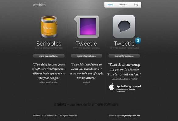
The ate bits site is simple, user friendly and easy to use in its design. The large icons make it easy to select which product you are interested in, and when you click on the icon it unfolds into a single page where you are able to view the features, screenshots, and reviews of that particular application. Meanwhile at the top of the page, the other icons for all remaining applications are easily visible with great navigation structure, just in case when you want to easily switch back and forth between all of the other applications available on the site.
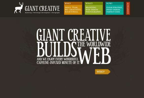
Not only the typography here is amazing, but the way the top navigation menu uses the hover effect to attract your attention, and the use of a scroll bar with a vibrant and beautiful link on the bottom right is very attractive and amazing as well! The entire interface is easy to use,user friendly and scaling around through the site, you can’t get lost anywhere in this design.
IconDock is a very flexible website in terms of functionality and usability. It’s user interface is bright and vibrant and includes a drag and drop list that makes purchasing icons much easier to use.
![]()
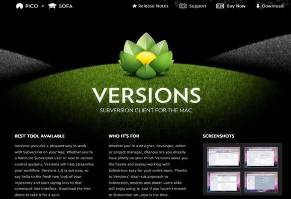
This website displays dark colors and rich user interface, however, using the website you are able to see that the dark color which has no effect on usability. This site is based on a single-page layout and displays all of its elements in a clean and well-organized way for better navigation structure.
The Silicon Prairie News weblog features nicely organized and nested elements spaced “just right” from one another. When you visit the site you don’t feel overwhelmed, there is a sense of clarity, and the navigation menu at the top of the page which is in caps and highlighted in different colors so you can’t get lost and makes it easy to use for its visitors. This is all compliments of a well thought-out interface design.
![]()
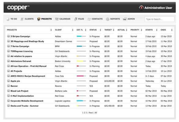
Copper posses one of the most easiest and attractive to utilize user interfaces for a detailed online application. It contains a variety of features that are easily accessible. The navigation is well organized and user friendly and displays sub-menus within a roll-over box. When you click on a project it takes you to a more detailed page where further information can be seen. Everything within the applications interface is well spaced, organized, and is never out of reach.
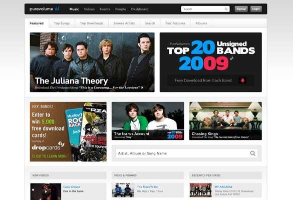
Pure Volume has a attractive web design with an even better graphical user interface. Here we can see 2 separate menus that are easy to navigate, every section is organized and cl separated, and it has a nice blue outline effect when you can hover over an image in anyone of the 3 middle sections.
This post has been shared by PixelCrayons, a well known web design agency