How do you know when it’s time to web redesign your landing page? A website with excellent user experience (UX) grabs the attention of first-time visitors and moves them into the sales funnel. If you’re like most business owners, you’re constantly tweaking your landing pages to get the best conversion rates possible.
In a survey by Databox, they found the average landing page conversion rate is around 26%, making anything over that excellent. Average rates vary widely by industry, how much demand there is for your product and individual page design.
How can you know when it’s time for a complete web redesign versus a few small changes here and there? We’ve identified four key factors screaming at website owners to redo their landing pages. We’ll also share a few examples of sites with truly stellar design.
How Do You Test a Landing Page?
Before you begin your web redesign, you must know what needs fixed. Conducting A/B split testing is your best source of information on what’s working and what isn’t. Check your heat maps to see what areas users ignore and you might cut without changing the focus of the page.
You also need to understand your target audience. What pain point are you solving for them? How can you hone in on that and tie it to the goal for your page. Here are four things to look for to help you decide if it’s time for a landing page web redesign.
1. Low Conversion Rate
Is your conversion rate below industry standards? Perhaps it has dropped in the last few months. For some types of businesses, there is a saturation point where you need to come up with fresh offers to keep current customers interested.
If your conversion rate suddenly drops, you may need to rethink your offers and come up with a new approach. You can figure out your average by taking the total number of conversions and dividing them by the number of unique website visitors.
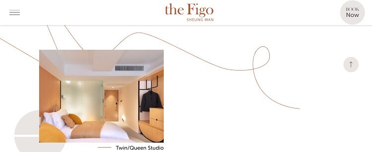
The Figo utilizes animation to grab user attention and encourage people to click on their call to action (CTA) button and “book now.” Note the use of white space and a minimalist approach to keep the focus on the action they want site visitors to take.
2. Stale Design
Has it been more than a year or two since you revamped your landing page? New technology and design trends make an untouched site look dated quickly. Research the latest design trends to see what’s currently popular and if it fits your personality as a brand.
Swap out the colors on your CTA buttons or add an informational video to grab interest. Know the current web design trends, such as beautiful parallax scrolling or three-dimensional effects.
Study your competitors. What do their landing pages look like? Have they included any features you’re missing? How important do you think those elements are to driving growth?
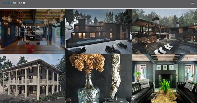
Alpha Genesis Design uses the top of their landing page to showcase their best designs in a portfolio set up. As the user scrolls down, they’re given tidbits of information through a parallax experience. As the user moves the cursor over different images, they expand or contract to create a realistic experience.
3. Lack of Mobile Responsiveness
DataReportal estimates 4.72 billion people use the internet with a growth rate of 7.6% per year. Although many still access the world wide web via both desktop and mobile devices, a huge 92.8% use smartphones to go online at least some of the time.
If your landing page doesn’t convert well on smaller screens, you’re missing out on a lot of traffic. Check your landing page to see if the images and text scale down to match the cell phone screen.
Are elements easy to click on a smaller space or do you need to adjust button sizes or make the area surrounding the CTA a bit larger? Look for ways to make it easy for users to sign up without having to type in as much information. Integrate your registration form with Google, Facebook or another third party service already hosting personal information.
4. Low Search Engine Ranking
If people can’t find your landing page, you aren’t going to gain many new leads from it. Figure out if you rank for the keywords you’re targeting. Do some searches to see if your site pulls up. If not, how far down is it in the search results pages (SERPs)?
Your goal is to get as high up in the SERPs as possible without having to pay for ad space. Keep in mind that search engines such as Google rank the quality of your content when deciding how well you match the search phrases.
You can improve your landing page by adding informational videos and links to quality content elsewhere on your site. While you don’t want to overwhelm your site visitors and distract from your CTA button, you do want to provide enough valuable content to attract people in the first place.
Try different ideas until you hit on the right balance of information and sales pitch.
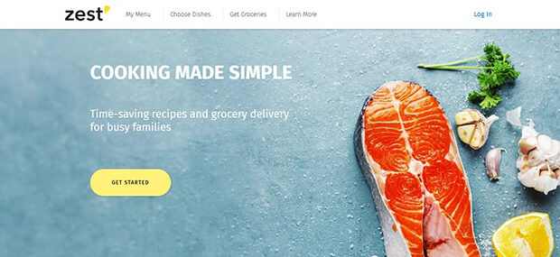
Zest is a recipe and grocery delivery service. When you first land on their page, you see a headline, tagline, beautiful image and a CTA button that reads, “Get started.” However, as you scroll down, you’ll find valuable content that helps them rank higher in the search engines.
Note how they utilize trust factors such as customer testimonials and a short bio and photo of their culinary chefs. They add a video showing how the service works and plenty of beautiful images outlining just what you get from their service.
Never Stop Redesigning
The key to a successful landing page is to never stop fixing it. Every week, try something new to see how it translates into search engine optimization. Run split tests to see how your target audience responds to your tweaks. Watch what your competitors do and try new things to keep your conversion rates high and landing page up to date.
Eleanor Hecks is editor-in-chief at Designerly Magazine. She was the director at a marketing agency before becoming a freelance web designer. Eleanor lives in Philadelphia with her husband and dog, Bear.