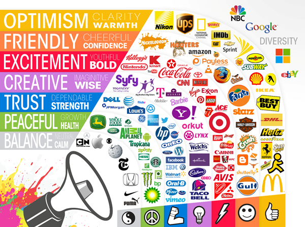
When you look at the logo of a brand, have you spared any thought to their choice of colors in the logo that they have had designed? Today a red, white and yellow logo immediately signifies a McDonald outlet and the yellow and blue logo shows us it is visa. But we have never given thought to why these color combinations were picked. The motivation behind this has to do with the psychology of colors and the way in which our minds take in a color and the message that we draw from it. We may not even be aware of the way the message is being sent to our brains via an image. It clearly shows that color psychology plays vital role in the designing of professional logos.
Here we will look at the ways in which many colors will have an effect on those seeing the logo. First we will look at the messages our brains get when we see different colors and also a look at colors in the way they complement each other. This should have an impact in the effect your company logo will have.
What colors tell the people look at them?
When you see the yellow and blue combination of Walmart for example, what do the colors tell you? In most situations blue is the color of power and confidence while the color yellow is of being upbeat. Combined these two pack a good punch and tell us what the company wants us to feel about the brand.
Colors carry a h1 message with green suggesting good health and growth, while brown tends to be more earthy and shows usefulness, while red shows intense emotions, purple manages to show a lushness, white is a symbol of pristine things and black is the bold color.
The inferences we have given are all of a positive nature but colors do have negative connotations. The same green that is seen as a prosperous color is also the hue of jealousy, like red is for fury and black means demise. While this actually is not much an issue while making a logo design due to the many elements that go into a brand, one still has to keep these things in mind.
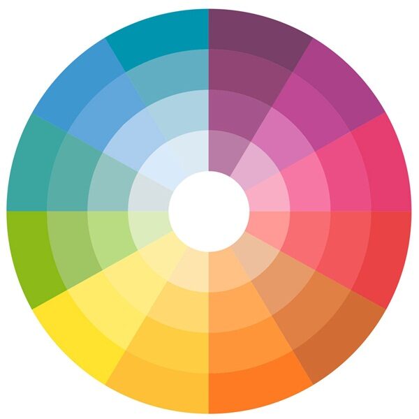
Using a color wheel to pick out the right tone of color
If you are not careful in picking out colors they may not send the message they want to. So instead of doing it randomly, do make use of a color wheel. This is a tool that will help in putting colors as per the way they work with each other. The norm is that you can go with colors on the opposite sides of the wheel to ensure that they complement each other.
Normally the colors that are side by side may not work out that well. It goes without saying that all this will be dictated by the brand image of the company. But in spite of that do take colors that work well with each other.
Why are colors so important in designing of logos?
Even without us being aware of it colors play a part in the way we view things. The colors seem to touch a subconscious part of our brain even without our awareness. Each color like the ones we see online or on roads or anywhere else have an effect on our psyche.
Just think about how many times the logo of a company is shown to people. You are hit by this several times throughout your interaction with them whether it is in person or via television and other media. Since it is shown and seen so many times, the colors in the logo need to be selected with care
We are creatures that are impacted by what we see and then we respond to that too. In this case a logo that company uses will leave its own imprint of the brain which will then affect our decision making. That is why color of logo for companies is so vital.


