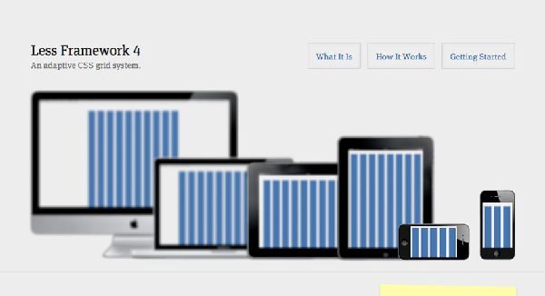
Less Framework is an adaptive grid CSS Framework that is pretty simple and helpful in creating stylish and elegant adaptive websites which will be easily adaptable to the different screen resolutions and various gadgets such as Tablets, Smartphones , Desktops , iPads and other touch screen devices that are a crucial part of the modern web nowadays. Less Framework 4 consists of three sets of typography presets and four different layouts that are based on one grid.
The main motive of Less CSS Framework to develop websites that have multiple efficient layouts to make sure that the feel of the website is consistent. In this framework each of the web layout is dependent on the same single grid and thus there is very much possibility that the elements that you use in one layout can actually be reused in the other web layouts devoid of having to make major changes. For instance if you consider changing the font size of an element or the width of an element in a layout then it is more than enough and you will not have to change it for other layouts as it will automatically work for another. You can as well fit in the elements without making any further changes with the help of the typography presets and the usual baseline grid.
LESS is an open source CSS framework licensed under MIT. Thus you can make use of this framework freely and as per your requirements till the time you are clearly mentioning the license comment on top of the CSS code or you are somehow or the other linking it to the website somewhere from your website. This framework does not have an in built or predefined precompilers , column classes or any other wizard tools thus making it the most simplest CSS framework to be used. This framework lays emphasis on the fact of allowing people to write CSS and HTML the way they want for the reason that each person has his or her own style of writing.
Different Layouts of LESS CSS Framework
1) Default Layout
This layout is most commonly used for tablets, desktops and laptops in the landscape format for all the old web browsers. One can split this layout in accordance with the Golden Ratio into six different columns that is generally the standard width for any long term text. You can define near about ten columns with this layout each of 992 pixels.
2) Wide Mobile Layout
This layout is just a perfect fit for all the large mobile devices such as iPod and iPhones in landscape format. This layout inherits all the characteristics from the Mobile Layout and Default Layout thus it is easy to code with this layout. You can define near about five columns with this layout each of 480 pixels.
3) Mobile Layout
This layout can define three columns with each of 320 pixels and has munificent margins that will allow the layout to breathe.
4) Table Layout
You can define eight columns each with 768 pixels and is just ideal for the long form reading when you are using 6 column centered wide text.