Time and again you must have come across the phrase, “To catch users’ eye” while reading topics related to website design. It is quite obvious that websites are created keeping users/visitors in focus and the various design elements are positioned to make the site visually appealing. Despite the fact that designers follow all the principles of a good web design, still there is one area which often goes unnoticed. Here we are talking about the Eye Movement of visitors, also referred to as Visual direction.
A designer must study the eye movement patterns and then design the website to create the desired impact upon its users. An Eye movement pattern is nothing but the course our eyes take while looking at something. In a web design, it is the movement of eyes of the visitors while viewing a web page, that is, a pattern which indicates what they notice first and what they come across the last.
Why study Eye Movement?
From designing part, studying the eye movement helps a lot as it can guide the designers in placing the various elements appropriately to create the maximum effect on the readers and develop their interest. When it is known to designers as to which are prominent areas to utilize, it aids their designing task. This makes us come to yet another important term known as “Hot Spots”.
Hot Spots are those areas on a web page that grab most of the users’ attention. In other words, section/regions of a web page that catches the users’ eye predominantly are called Hot spots. If these areas are identified first, it becomes easier for a designer to effectively design a site and place the most important elements in those sections/regions.
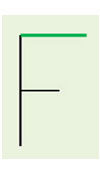
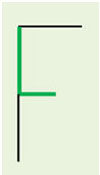
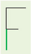
The F- pattern describes the movement of the visitors’ eye on a web page and helps identify the hot spots. According to this pattern, a user while scanning a site:
• First notices the top left corner of the page and moves horizontally to reach the right side of the page
 • Moves down a little on the page, follows the same pattern again but this time, the user’s eye while scanning horizontally stops midway on the page
• Lastly, the user moves down vertically to reach the bottom left of the page completing the F pattern
Tips to create effective web design and control Eye Movement
Text, rather than images catch attention
Contrary to the general opinion that Images are more eye-catching, it is observed that users are more attracted to the text part. The simple reason being they visit a site to find out information rather than viewing images. Therefore make their eyes see the content first.
Make best use of the top left corner
It is established now that top left corner is the most important part of a web page as users’ eyes first see this corner. Fill it with crucial information. Mostly, this corner is used to place Logo along with a tagline to establish the identity.
Calm their eyes with White space
The effectiveness of white space is known to every designer. By preventing the content from appearing cluttered, white space favors the users and helps them scan smoothly the various parts of the site.
Use Clear images and place them at suitable location
As Images do form an important part of the website; it is required of the designer to use relevant images. Images should be such that they appear clean to the visitors even if they view them for a few seconds. Also, their positioning is important on the page so place them at Hot spots.
Fonts and text size do matter
The type of font used on a site does make a lot of difference and so is the case with the size of the text. A different font can be used at places requiring attention. Similarly the text area which needs to be highlighted can be made bolder, etc as it may demand. Since eye movement tells a lot about how a user behaves while visiting a site, having the knowledge of it will definitely help in designing quality user friendly sites.
We hope that this brief information provides some useful insights to our readers who are invited to give their valuable suggestions.
About the author : Mark Harvey, web developer working with XhtmlJunction, a popular web development company offering services like PSD to HTML, PSD to WordPress, PSD to Drupal, PSD to Magento, and few more. PSD to HTML now at $39/8 hours. Connect with us on Twitter.
