When we set out to design a website, our primary focus is on the homepage and the header. The footer design is often relegated to a badly designed section of the website. Ideally, this should not be the case. Footer is the last part of the website that the users view and last impression matters.
It is good to follow the conventions and add a link to contact us, affiliate program, etc. in the footer section but it should not be made a dumping ground where you cluster all the information that you do not deem important like disclaimers and other links.
The footer of the website is equally crucial as the header if not more than it. This is because this is the last time you can make a call to your visitor to perform an action. Depending on the nature of the website, the footer can be put to different uses. For instance, if you have a blogging website, you may want to include the link of the most trending article in the footer section or add a signup field for the newsletter.
If you ask yourself – what do your expect the site visitor to do when they reach the bottom of the page, you will find some compelling answers to revisit your website’s footer design. Also, the footer design along with the website must be responsive and you must test it with a reliable responsive testing tool.
The footer design will vary from website to website and there is no set rule to design it. As mentioned earlier, a blogging website should ideally have a link to the latest blogs and a product website should have a call to action button or a signup form. The convention regarding the footer design do exist and should be followed to a certain extent. For instance, the contact detail link, Disclaimer, Terms and Conditions, etc. are often searched at the bottom by the users. However, you must look for the innovative ways to prioritize the content to be shown in the footer and identify what not to include in it.
Some Websites with Remarkable Footer Design
The websites listed here are great examples of how a footer should be designed. Go through them and get an idea if you have been in a fix about designing your website’s footer.
1.No-refresh
No-refresh is a website that offers online product designer tools that can be easily integrated into existing e-commerce portals for designing t-shirts, laptop skins, shoes, buttons, etc. The footer of the website has been carefully designed to include all the important details that a user requires. There is also a contact button and social links for interactivity.
CSSChopper is a well-known company that offers web development services to its global clients. Its website has a footer that can be an inspiration to many. It has been kept simple with all the contact details and link to the client area and FAQ. The footer also displays other sister concerns of the company and salient features of the services provided by CSSChopper.

AppsChopper is essentially an app development company and the footer of its website features in this list for all the right reasons. It has a simplistic design with all the important links like disclaimer and privacy policy included.
theem’on is a marketplace for WordPress Theme, templates, plugins, etc. and its footer design is an example for all such websites. The footer follows the convention and still brings about uniqueness with a list of resources offered for purchase, newsletter subscription field, and social icons.

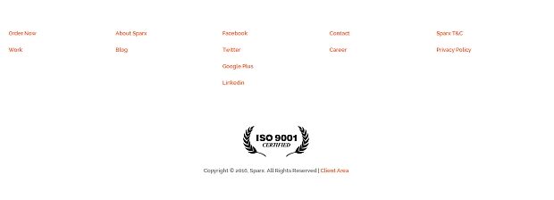
The website footer design of Sparx IT Solutions is ideal for web and app development companies as it has the right blend of aesthetic design and content. Only the most relevant links have been included like Order Now, social links, privacy policy, etc. A newsletter subscription field is also there to expand the user base.

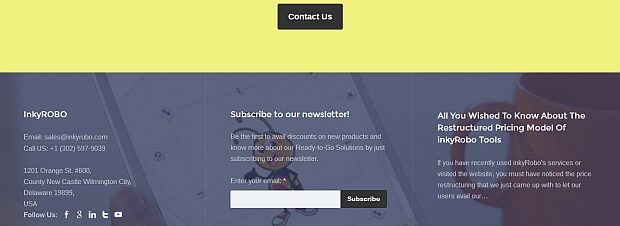
inkyROBO’s website is the perfect example of an online t-shirt designer tool provider. The footer of the website is in sync with the overall design and is divided in three sections. First one has the contact information, the second section includes newsletter subscription field, and the last one has a link to the latest blog on the website.

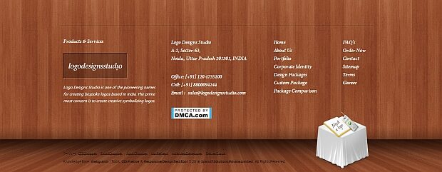
As the name suggests, this website is for a Logo design company and the footer is also true to its name. The footer has contact information, details of services, and an attractive image as a call to action.
This website has a footer design that not only looks very attractive but also succeeds in sending across their message loud and clear. They have refrained from adding any unnecessary content in the footer and stuck to the basics.
The footer design of the HireWebDeveloper’s website is simplistic and yet conveys a strong message. It contains a newsletter subscription box along with the contact information. The design layout of the footer is in sync with the overall website’s design and even accentuate it.
Closing Thought
Footer design needs as much attention as other sections of the website. If you have been planning to design a website for your business or just revamp an existing one, this list is just for you. You can get a fair amount of ideas about footer design and make sure you do not commit mistakes in designing the website’s footer. Have a happy Footer designing!