Many people use internet every day, but if any person is asked about footer design, he might get the picture of remote in his eyes. This is because of the fact that the web designer of footer designs is not appreciated by the user at all.
May, he/she could not be able to bring some attractiveness in the design or the user might not give it the credit due to effective body design of the web app. If you really want that the user gives you the credit of footer of the web app then you need to use creative footer design to increase user interaction in web app.
These creative footer designs are given below. They are as follows:
The Midnighters Club
It is one of the best examples of creative website footer design. This footer design simply represents that a simplicity and elegance could easily grab users attraction.
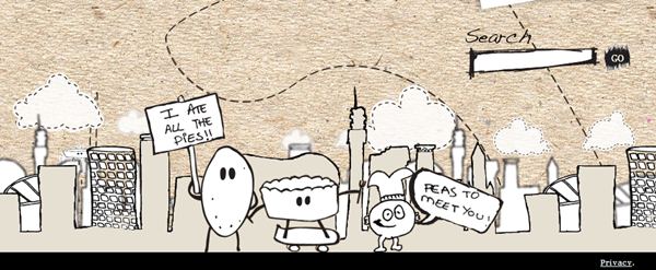
Urban Pie
It makes use of illustrated characters for welcoming the visitors. This footer design is of utmost importance. The website for this footer design keeps the things easy and fun. It gives you cartoon style illustrations and need to know information. Some of the features of this footer design are:
- The footer do not have any call to action elements
- Footer is simple sketched skyline
- It has got a lovely touch
Northern Classics
It is a cool footer design that makes use of multimedia to relate the footer with the topics present on app/website. It also uses the moving pictures to make the users get fascinated with design.
Monocle
This footer design helps to reduce the complexity of main navigation. One of the best ways to utilize your footer is placing a secondary navigation on it. It is one of the best ways for big websites to utilize the footer area. Some of the benefits to use Monocle on footer are:
- It place the links to the less significant areas of website or apps
- It reduces the complexity of major navigation
- It also includes the search bar to less vital areas of apps or websites
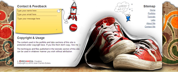
Mecannical
It is great website/app footer. One of its prominent features is that it attracts the visitors by providing the social media interactions. It also have a feedback section on the footer.
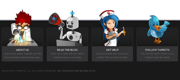
Tapbots
It uses the illustrations to a good effect that might not be the case with all sites or web apps. Tapbots are the utility robots that are engineered and designed for iPod and iPhone touch. They are created by Mark Jardine and Paul Haddad. Some of its great features are:
- They aid you with the help you need in website or app footer
- It has four beautiful illustrations to stand side by side
- It also uses manga style characters
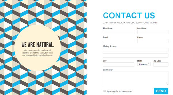
National LGBT Museum
It focuses on “contact us” to utilize the footer space. Some of the best features of Rdio are:
- Users can easily contact the organization.
- It focuses on enriching the homepage with user friendly interface allows them to contact for any kind of suggestion or complaint.
- It draws user attention on footer
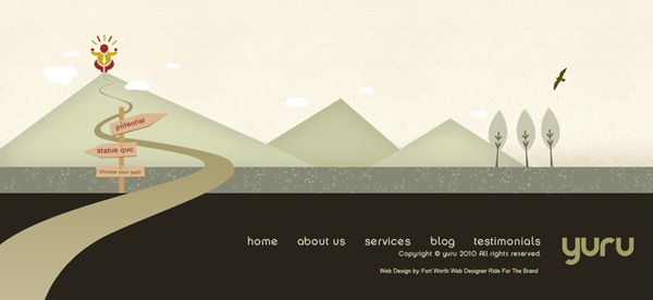
Yuru Inspire
It makes the footer interactive by placing the wonderful pictures on footer to attract the visitors. It draws the attention of users through footer.
Soho Fixed
This footer design gives priority to newsletter sign up on the footer area of web app or website. This strategy is the alternative of placing the call buttons on footer to provide encouraging environment. The call buttons are replaced by newsletter signup on footer. A secondary menu is also placed on the footer to make the navigation easy. Some of its best features are:
- It gives the playful use of scale
- Social Media Buttons are placed in very creative manner.
- It helps you to stay connected with the users after they sign up for newsletters through email.

