Responsive Web Design has gained huge popularity and demand over the years. With novel gadgets being developed every year it is necessary for a Web Developer to make sure that the Website they design is compatible with all the various gadgets that are in the market. CSS3 Media Queries are far beyond the usual media type that were used since the innovation of CSS2.
CSS3 Media Queries help you add great deal of Media Device Responsiveness to your websites. There are loads of Media Queries that you can embed into your Web Design but in case you are unaware of this fact in that case you can begin with the CSS Media Query Boilerplate which is a great guide to the usage of Media queries however in case you would like to add a target specific device for your website then the Generic base will not work out and you will have to change the media queries in accordance with the device.
Media Queries Specification is answer to all the problems that the Web Developers used to face with regards to improving the Device Specific Website Repose. CSS3 Media Queries provide a wide range of possibilities with the use of “Media” Attribute that is actually responsible in controlling the application of various styles.
CSS3 Media Queries have paved way for enhancing the device specific website responsive in a great manner by taking the previous scheme to next level by letting you target the styles based on a wide range of device characteristics such as Resolution, Screen Width, Orientation and lots more. The best thing about the Media Queries is that they not only focus on specific classes of devices or particular devices but rather they will allow you to actually examine the physical characteristics of any gadget or device.
For Instance, if you aim at targeting Apple iPhones that usually have a screen resolution of 480 pixels horizontally. You will simply make use of the media query by using 2 components of which the very first is to set the Media Type Attribute value to “Screen” and the second id to enclose the actual query within Parentheses so that it contains the details on which media feature should be inspected along with the target value.
Below is an example listed:
The above syntax of the query implies that it will be applicable only to devices that have a screen & whose Web Browser Window size is not greater than 480 pixels in terms of horizontal resolution. If it encounters any other device which does not meet the listed specifications in the query then the link would be ignored simply.
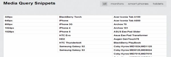
Here is a list of some interesting Media Query Code Snippets for top-notch trendy Gadgets in the market :
1. Samsung Galaxy S3
Here is the Media Query Code Snippet that can be used for the Samsung’s popular S3 Model :
@media only screen and (-webkit-device-pixel-ratio: 2) { }
2. Samsung Galaxy S2
Here is the Media Query Code Snippet that can be used for the Samsung’s popular S2 Model :
@media only screen and (device-width: 320px) and (device-height: 533px) and (-webkit-device-pixel-ratio: 1.5) {}
3. Apple iPhone 5
Here are 2 Media Query Code Snippets and either of them can be used for Apple iPhone 5 Application Development :
    a. @media screen and (device-aspect-ratio: 40/71) {}
    b. @media screen and (device-width: 320px) and (device-height: 568px) and (-webkit-device-pixel-ratio: 2){}
4. Apple iPhone4
Here is the Media Query Code Snippet that can be used for the iPhone 4 Model by Apple :
@media only screen and (-webkit-min-device-pixel-ratio : 1.5), only screen and (min-device-pixel-ratio : 1.5) { }
5. Apple iPad 3
Here are 2 Media Query Code Snippets that can be used for iPad 3 for applying styles based on the Orientation of the Screen as to if it is in Landscape Mode or in Portrait Mode :
     a) Code for Applying Styles in Portrait Mode :
         @media only screen (max-device-width: 768px) and (orientation: portrait) { }
     b) Code for Applying Styles in Portrait Mode :
         @media only screen (max-device-width: 1024 px) and (orientation: portrait) { }
6. Blackberry Playbook
Here are 2 Media Query Code Snippets that can be used for BlackBerry Playbook for applying styles based on the Orientation of the Screen as to if it is in Landscape Mode or in Portrait Mode :
    c) Code for Applying Styles in Portrait Mode :
       @media only screen (max-device-width: 600px) and (orientation: portrait) { }
    d) Code for Applying Styles in Portrait Mode :
       @media only screen (max-device-width: 1024 px) and (orientation: portrait) {}
7. Google Nexus 7
Here is the Media Query Code Snippet for the Stunning 7 Inch Display and Powerful Google Nexus 7:
@media only screen and (device-width: 600px) and (device-height: 905px) and (-webkit-min-device-pixel-ratio: 1.331) and (-webkit-max-device-pixel-ratio: 1.332) {}


