A letterhead is the heading at the top of a sheet of letter paper. This heading usually comprises the name and address of the author of the letter, a logo of the company of which the author is a member and in some cases a background pattern. I must add that sometimes the term “letterhead” is used to refer to the whole sheet printed with such a heading. Some sheets also contain some printed information at the foot of the page. Hence the page, the headings and the footer information can all be collectively referred to as the letterhead.
If you own a business and you don’t use a letterhead for your company then you are missing on on a great opportunity. Not only it will impress the readers whom you address by your letters but it will also do a good job of spreading the word around about your business. The more people see your letterhead the more people see your logo, your company’s name, your address and your business.
But a letterhead will only help your business if it is designed professionally. If it has a cluttered design, has grammatical mistakes, and the color spreads out of your logo then instead of helping your business it will hurt your brand name. So to help you choose quality letterheads below I have collected 35 awesome letterhead designs for your inspiration.
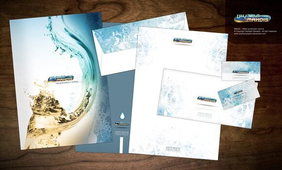
1. Mahdis Water purification
This is an creation of sepinik.
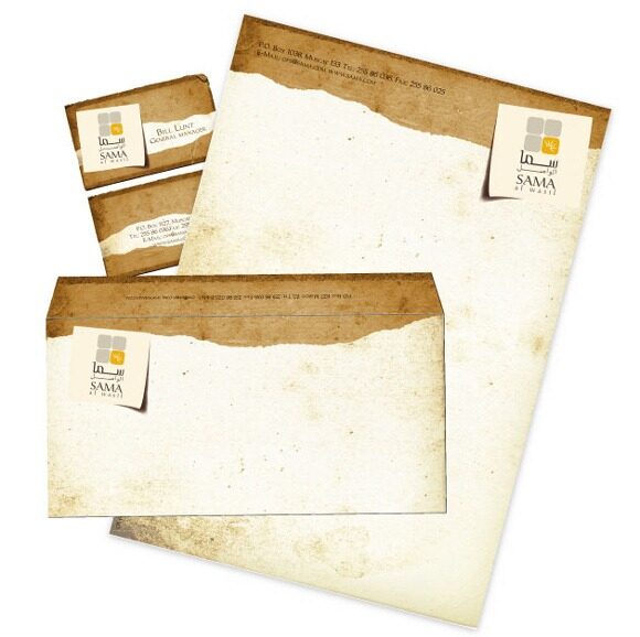
Stationary designed for a desert camp in Sultanate of Oman.
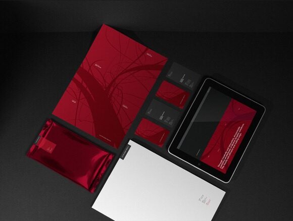
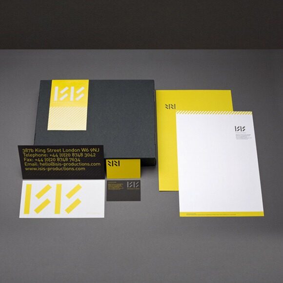
Re-branding of independent film company ISIS productions. ISIS wanted an identity that is as rich, bold and iconic, as the artists and music it documents.
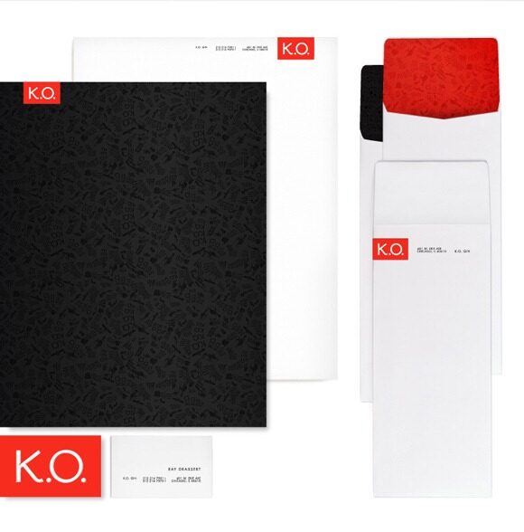
Identity System for K.O. Gin. Silkscreened patterns line the inside of the envelopes and the back of the letterhead.
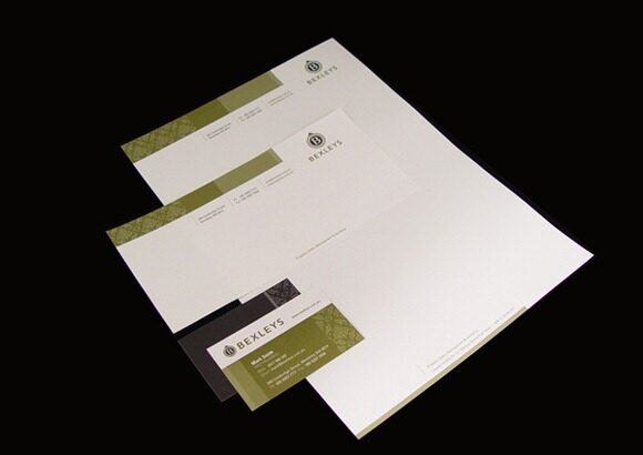
Bexleys wanted to create a new company with desired market perceptions of, dependable, established, not young and trendy, credible, experienced, friendly, no-nonsense, upper end of the market, high quality service and well-organized.
BSEEN is a outdoor advertising & decor company based in Norway. I was inspired in the Norway flag form and colors, snowflakes, stars and flowers for the graphic style..why? I have done a relation in the things what making the decoration in Norway landscapes, snowflakes, the flag, reindeers….so it BSEEN will to do the decor of all different business models companies there.
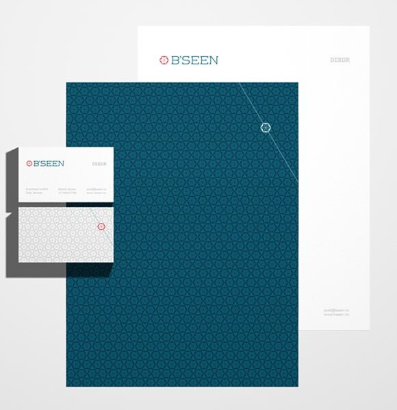
Logo design with stationary.
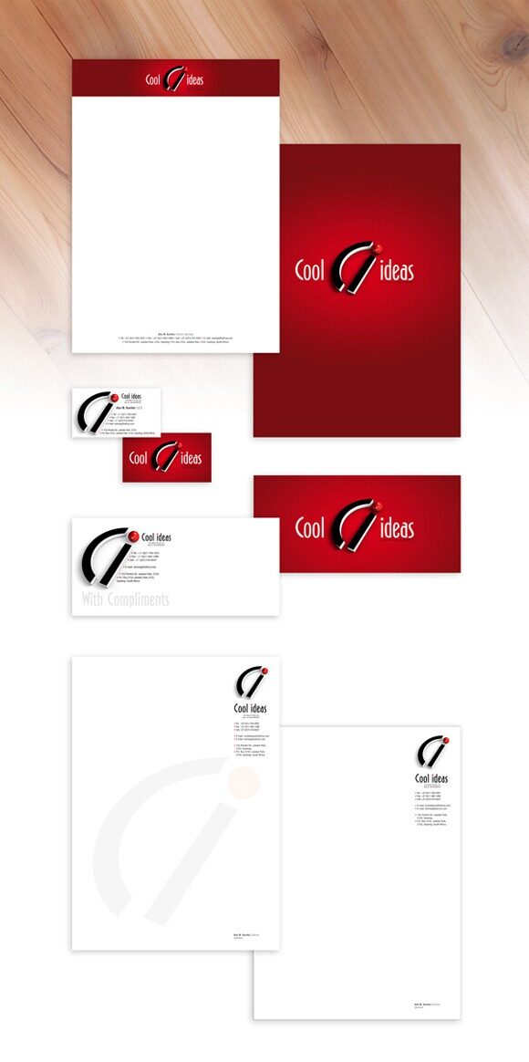
Corporate branding for Cool ideas.
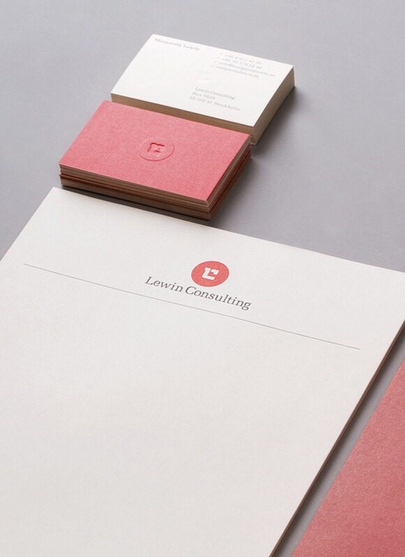
Branding and web design by Lundgren+Lindquist design bureau for Lewin Consulting, a recruitment company in Stockholm, Sweden.
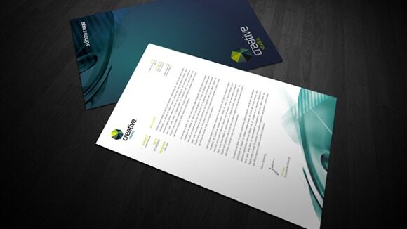
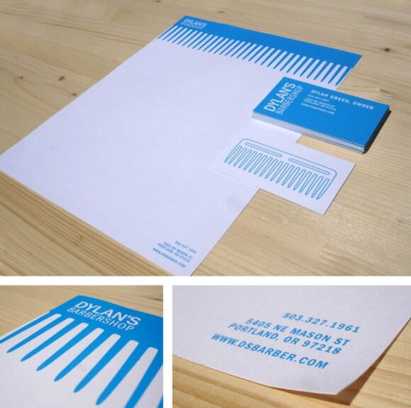
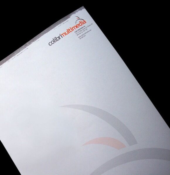
A work done on an internship at JED Creative.
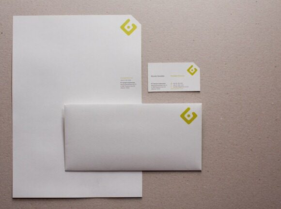
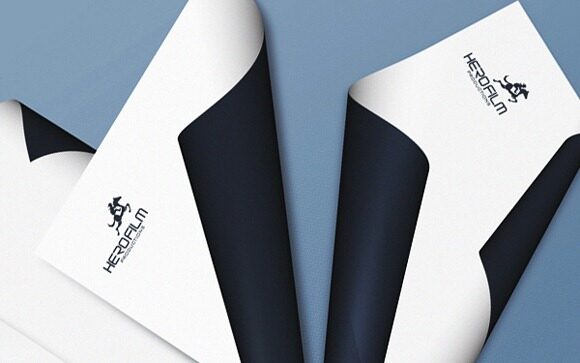
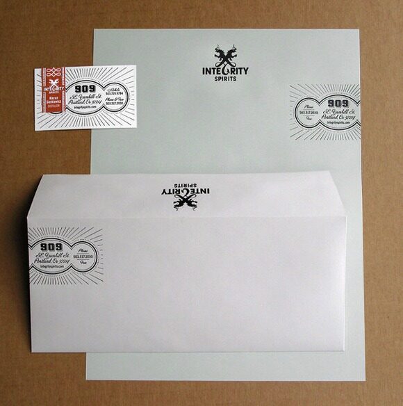
Identity design, including business papers, for Integrity Spirits a micro-distiller in Portland, Oregon.
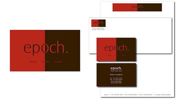
Rich colors were used to give a calm, warm feel to this home decor/floral store. We designed business cards, letterhead, envelopes and thank you cards for this retail business.
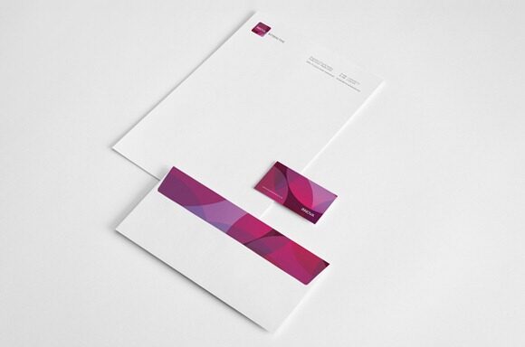
Letterhead system includes letterhead, envelope and business.
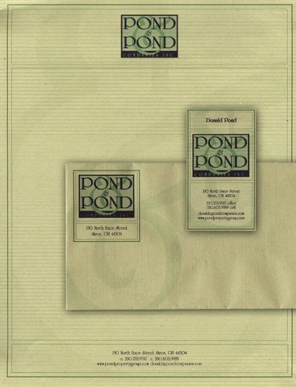
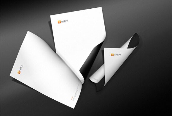
A stationary for a mock up business.
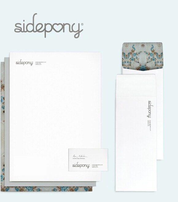
Sidepony is the creation of Kimberly Dawn Robertson. She hand-prints limited edition cards and clothing items and sells them online and through stores around the US. We gave her a logo with heart.
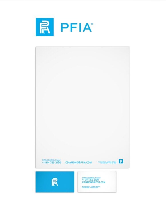
Identity system for PFIA bank, a subsidiary of MBIA.
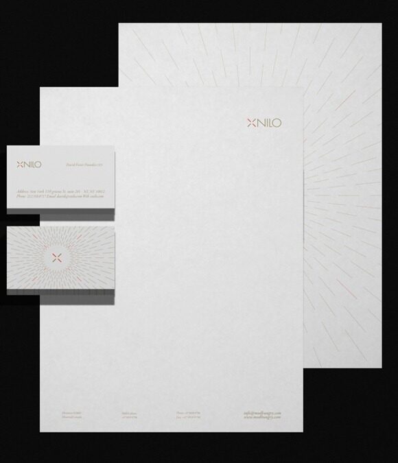
Visual identity X-nilo design studio.
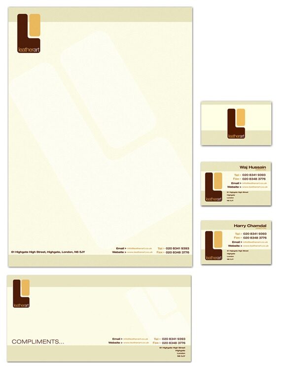
I am currently branding a new company that deals in bespoke leather goods, i.e. pieces of art made out of leather pretty awesome stuff, I’ll have to get some to show you, very interesting techniques. This is their logo and stationary.
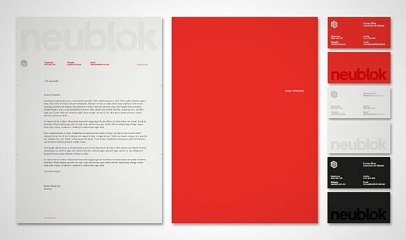
This was our original incarnation, so naturally, we created everything: the logo, stationery and website. The bespoke font took its inspiration from classic sans serif faces such as Helvetica Neue and Akzidenze Grotesk.
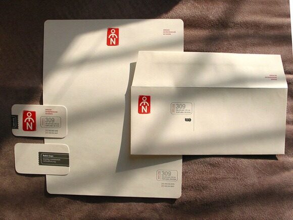
OEN Logo and Business papers were designed to echo the position of wisdom.
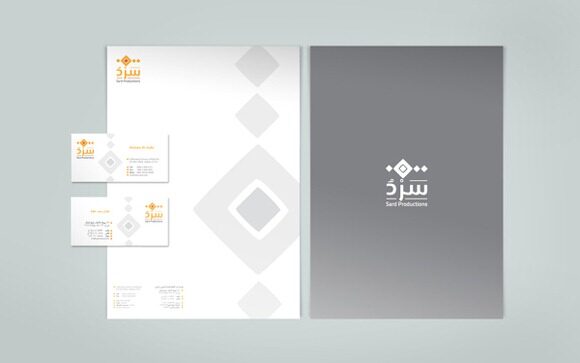
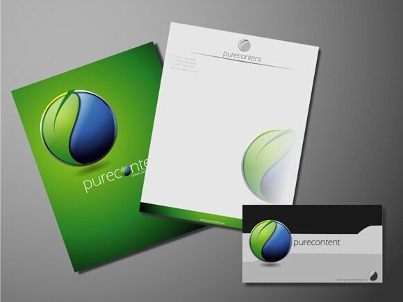
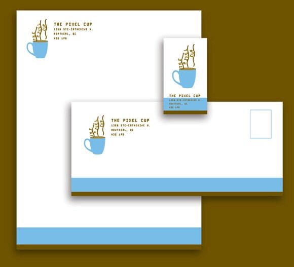
Coffee Makers & Pastry bakers Brand.
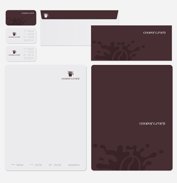
Logo and corporate stationary design for Tropicana Residents’ Association, Tropicana Residents’ Association is one of the high-end residential area in Malaysia, a gated community surrounded with hundreds of luxury houses and famous people from a movie star to an influence government staff.
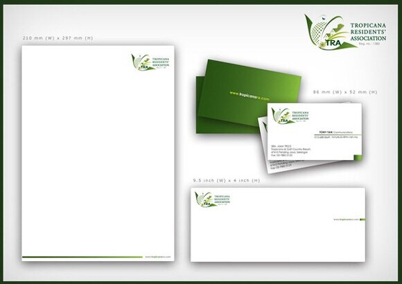
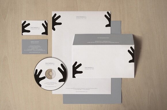
To highlight that snowball in to film and print production company we tried to enhance the essence of direction in to graphic. If you look deeply it also interprets name …. snow ball fight.
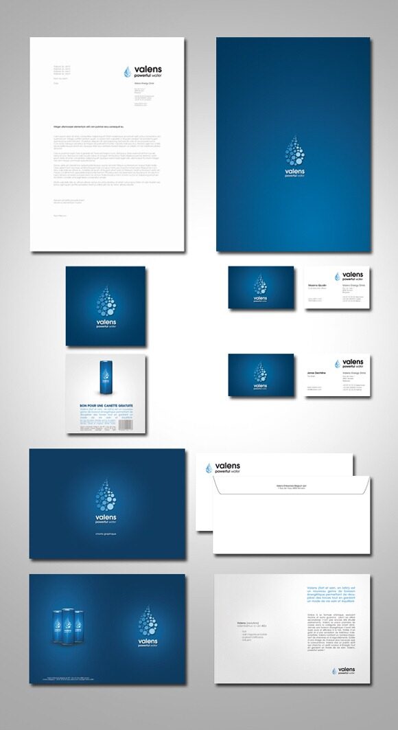
Branding, Packaging and advertising for an healthier energy drink.
I hope these designs will inspire you to create quality letterhead for your company. Let me know in the comments below what do you think about the above collection.
Author Bio
After making some mistake of choosing a web host, James decided to help other webmaster by creating WebHostingJuice, a website with many web hosting reviews. Start reading his Bluehost review to learn why he like it the most.