Gowning the website into the right design is not an easy task. It requires taste, patience and experience. In this article we’d like to share some thoughts about some things learnt throughout the years of experience in the web design area.
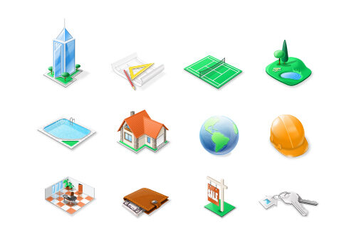
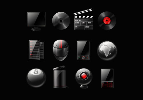
Speaking about web graphic tools, business icons, logos and buttons are on the front burner for creating the modern website layout. Business icons help to set up recognizability of a brand and visualize the goods and services it offers. So beautifying is not the major benefit of these small design elements. Smart, eye-catching business icons associated with your company will make a real contribution to the website promotion.
Considering the tips below may help you to enhance the visual quality and usability of your website.
1. Seek for unique business icons matching your website content and style.

If your are on your way of launching the start-up you will certainly try your best to make the project design catchy and recognizable. Unique web icons and buttons are the small secrets to make design exclusive. The most popular design style applied to web icons is “Web 2.0”. It looks quite modern ans smart and is good for creating the web page with a clean professional look. Web icons and logo represent your company, they hint what it deals with or you may order the custom icon set from a free-lance designer but this option may cost you more cash, time and efforts.
Well reasoned out website structure, carefully selected unique web icons will make a great contribution into your website popularity. The icons should be clearly arranged and interpreted. Their layout on a page shouldn’t overload its structure letting it stay understandable and the content blocks – readable.
Paying attention to the icons used on the popular companies’ websites, observe the features emphasizing their uniqueness and try to use the similar approaches. But do not copy design ideas thoughtlessly. It is apparent for the experienced Internet-surfers at once and doesn’t evoke another emotions but for scorn and ironic smile. And anyway you will stay behind the competitors who have already won the audience recognition due to their specific style. Your brand and your website should be respectable.
The major thing of the details design is giving the visitors a clear idea of what is actually being offered by your website and what makes your goods or services special. That’s the number that turns the light bulb on.
.
2. Analyze your potential customers expectations while selecting business icons

The first thing you need to consider while creating the new project design are expectations of your potential audience. This is the cornerstone of any successful business for sure. All design elements should follow the major website concept and aims. The style should correlate with the content.
Creating the business icon depicting the object different from what the user expects it to be is an epic fail. The color scheme and the general layout should meet the visitors’ needs. If we create a serious business website for a consulting agency bright childish and light-minded icons are unacceptable. Clean, austere and trustworthy icons will win in this case. The colors should be selected to reflect your business area better as well. Smart colors will help you to make the visitors believe in your stability and professionalism.
Taking into consideration your potential customers, you will use the proper business icons and other layout elements. Design is all about the details. You may object that small buttons and icons are not so significant for absorbing and digesting of content. But it’s a false supposal. Visitors are looking for some indicators and separators on a page helping them to navigate in the right direction. Noone is going to loose precious time and efforts to look for the useful information for minutes. So you are to find the ways to simplify navigation and content perception by using the proper web icons.
.
3. Don’t make the icons pop out too much. Make it simple but informative

Some may consider simple ideas too dull and predictable but in fact they always work. Simple things look great if you fill them with the right sense. The sense should be exact and not overexaggerated but still attractive enough to make the people like your product. Simple design supposes avoiding the details that make the whole image look messy or unclear.
The main features of simplicity are clear and readable typography, strict lines, nice hierarchy and localization. Blank space allowing the page to breathe is not less important, too. We’d recommend to make spaces between the objects of a white or another light color to let the eye rest on them.
The best readable font to be used for web icons is, of course, Verdana. The best text colors for the human eye are black, blue or gray ones. It’s not a secret that the dark text against the white background is a classic combination in both typography and web design. In caser you need to make the visitors eyes stop at some specific element you may make it brighter and stand out a little.
Use the benefits of the potencial audience analisis, relevance and simplicity in your projects designs and be the happy owners of smart and popular projects.