A good personal portfolio website, especially for any freelancer who relies on his or her creativity to find new clients, is essential. The site must not only be approachable, user friendly and state your ideas and objectives plainly, it must also be memorable. From the coolest logos to the best looking portfolios – here are some of the most beautiful, inspiring and creative designer portfolio sites on the web.
1. LAB3
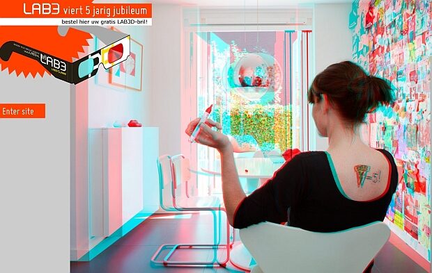
You don’t have to be fluent in Dutch to fall in love with LAB3’s eye-catching, super-friendly site. Skip the cool, though gimmicky 3D homepage, click on Enter Site, and you’ll be able to check out Annie’s home designs. The site is smartly abundant with high-quality photographs and accessible info. If it’s inspiration you’re looking for – the design more than compensates for the lack of an English version.
.
2. Bud Designs
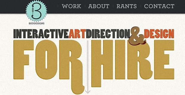
Josh Budd defines himself as an “Art Directing Freelance Designer that can make stuff move around on the screen” – and movement is indeed the name of the game. Both fonts and layout are colorful and pleasing, categories are easily accessible, and the About gives the impression of tasteful self-promotion. Note the Rants section – a great area to vent any web-related grudge one may bear.
.
3. As Creative Design
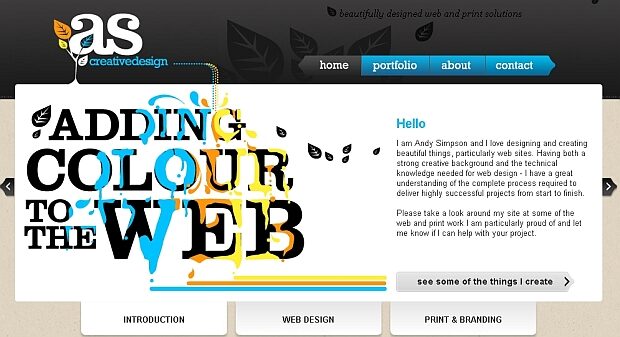
Opulent without being overwhelming, colorful without being an eye-sore – As Creative Design provides the perfect logo, as well as friendly navigation and cut-to-the-chase info.
.
4. Miki Mottes
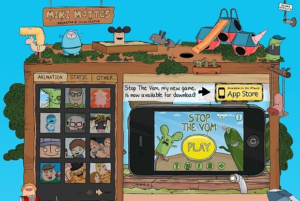
Equipped with a dark sense of humor, Tel Aviv based Miki Mottes has created a funny, vivid and for lack of a better word – adorable website. Whether you like his stuff or not, credit must be given for design originality.
.
5. Immotion Studios
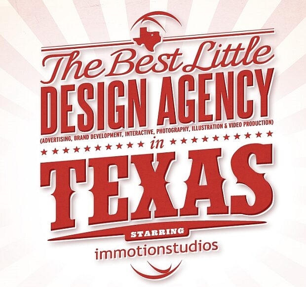
Promoting itself as “The Best Little Design Agency in Texas”, Immotion Studios certainly deliver a spectacular western-style homepage. Categories feel a bit over the top (Show instead of Contact and so forth) but the design more than compensates for any shortcomings in the textual messages.
.
6. Carton Blanc
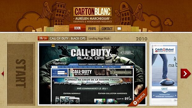
Can’t read French? No matter. Aurelien Marcheguay, the designer of Carton Blanc, is all about the visual experience. The colors mash to create a harmonious design, and navigation is brilliantly planned to enhance the experience.
.
7. Dote Design
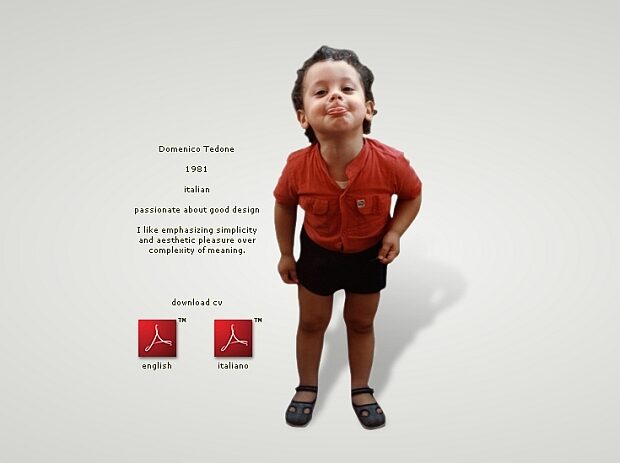
Domenico Tedone, a 30 year old Italian, has created a stunning design that gives new meaning to the simple act of scrolling down. He is a man of few words, which will allow you to be finished with the About in about 5 seconds, and move on to the work itself.
.
8. Okay Dave
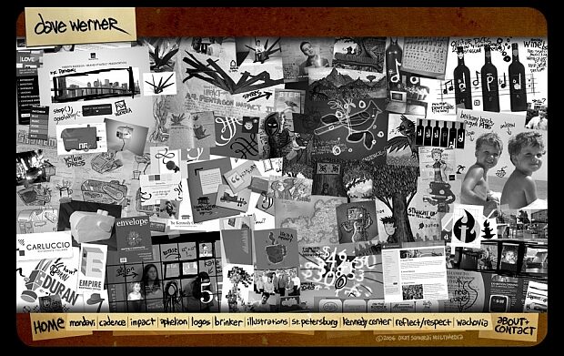
It is almost impossible to miss Dave Werner on Okay Dave: he just seems to be everywhere. So just skip the baby pictures and childhood videos – and focus on the pleasing layout.
.
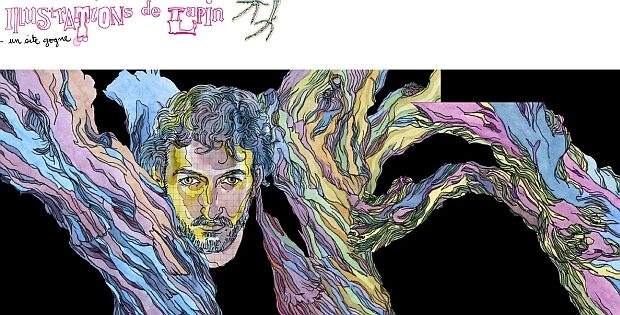
9. Les Illustrations de Lapin
A mannish pink, a minimalist touch, and a Frenchman that can write in English – what more can a gal (and guy) ask for?
.
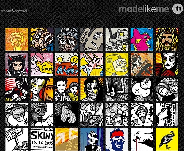
10. Made Like Me
The dark background, the bright colors – and the wisdom to keep it all simple. Made Like Me manages to set off its designer’s portfolio effectively.
.
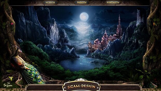
11. Sizam Design
Russian is no obstacle – as long as your mouse has one more click in it. You will not find much originality when navigating – but the graphics are riveting.
.
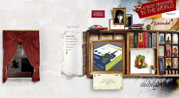
12. Foxie
Original, artsy, creative: Foxie’s homepage is a study in wondrous design. Like the books it uses as motif, the site lends itself to new discoveries with each new “reading”.
.
13. The Happy Time Cafe
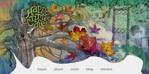
Pastel colors, delicate fonts, understated categories: you needn’t navigate to the About page to know, at first view, that this site was designed “by a girl”. A very, very talented girl.
.
14. Vault 49
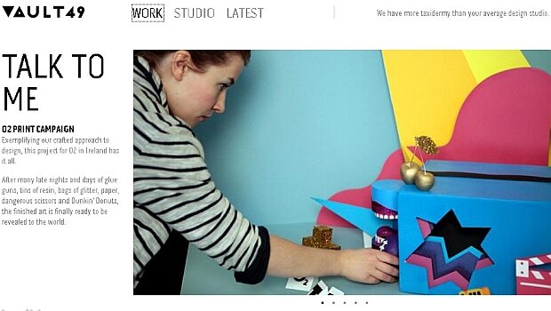
Big, colorful pictures, a white background and some name-dropping: it might sound simplistic enough, but the people at Vault 49 seem to know what works.
.
15. Seymourpowell
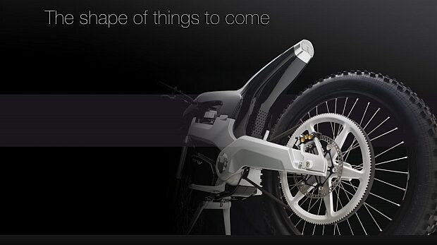
Clean-cut designs have a way of saying “Less is more” without spelling out the obvious. With Seymourpowell, you’ll find straightforward categories on your left, and a stunning deck-of-cards introduction on the right hand side; an impressive first impression.
.
16. Rudd van Eijk Design
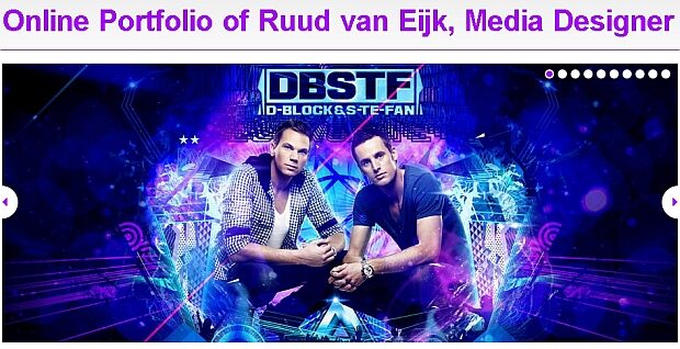
Kitsch is not a dirty word, especially when set against snow-white background. Ruud van Eijk, a young media designer from Holland, uses rather big fonts – but hey, some may think that’s precisely what big ideas need.
.
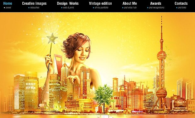
17. Graphic Design
Valentin Petroff might have gone for a more original name for his site, but he’s got it right in many other areas: the colors blend perfectly, navigation is super-friendly, and most importantly – the clean-cut yet elaborate design sets off his portfolio expertfully.
.
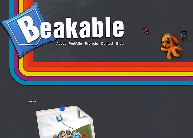
18. Beakable
Ignore the “Howdy” greeting when reading Iain Hamilton’s About. Better yet, ignore the whole About section and focus on Iain’s portfolio homepage and logo. These incorporate good colors and attractive, cut to the chase info.
.
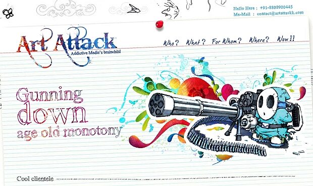
19. Art Attack
Set aside the somewhat childish mantras (Gunning down age old monotony? Honestly?) and the over-the-top categories (Cool Clientele, for example) and you are left with a very cool design indeed.
.
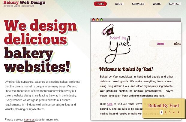
20. Bakery Web Design
Reef Light Interactive provides an excellent example of the way products can be in the heart of the design: the colors look creamy, almost appetizing, and give the much needed feel of a good home-baked pie.
.
21. M1 Design
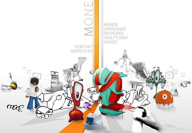
This is one foreign language site (unless you’re German) that should have an English Button – since the design is so fresh and captivating, you’d probable like to read what these guys have to say as well. No such luck.
.
22. Pioneers
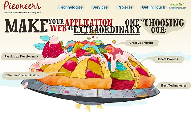
Web designers who put cakes in their homepage are simply playing the odds – for who doesn’t like cake? Notwithstanding the somewhat overused motif, Pioneer’s cake is sufficiently unique to make it work – and pop.
.
23. Weberica
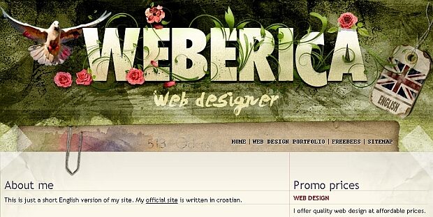
This Croatian web designer has opted to create a multi-layered site: his homepage consists of a huge, eye-catching logo; his web design gallery uses auto view to display his work, and the portfolio is shown on a different homepage, as creative as the first.
.
24. Carsonified
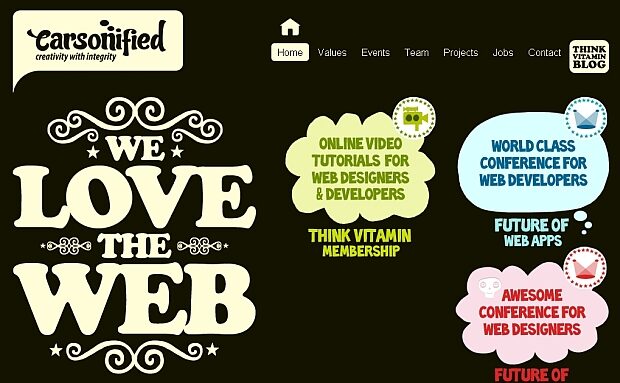
Carsonified skillfully illustrates how to maximize one theme and one design style: correlating font styles and sizes under differently colored categories, and beautiful art to match each category.
.
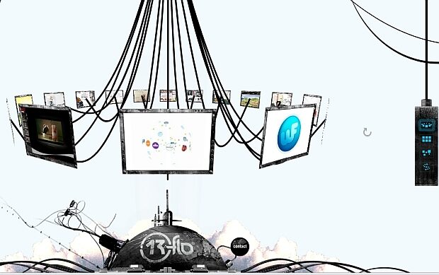
25. 13flo
Saving one of the best for last: 13flo uses a 3D touch menu which gives the option to choose between four menu layouts. The futuristic theme puts a nice finishing touch to a very pleasing browsing experience.
.
Author:
Galia Sivan is an editor and a translator. She’s passionate about reading, writing and the occasional shot of single malt whiskey, often in tandem. Recently, she has discovered an avid interest in cooking, but has yet to produce anything edible. Galia is also a big fan of wix.com the popular and free website builder.