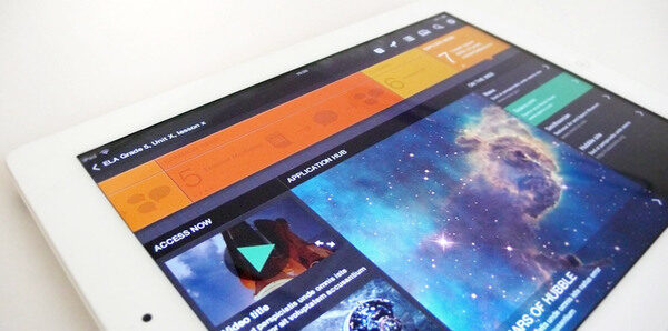
User interface design has been a hot topic in the web design community, and it’s constantly evolving as technology becomes more pervasive in everyday life. Design interface is critical to the success of any website, and it stands to reason that the easier something is to use, the more customers will use it.
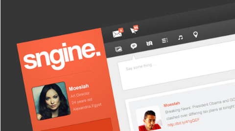
1. Sngine Network UI by Moe Slah
Sngine employs relevant icons separated by plenty of white space to make it easy for users to navigate the site and find their preferred features.
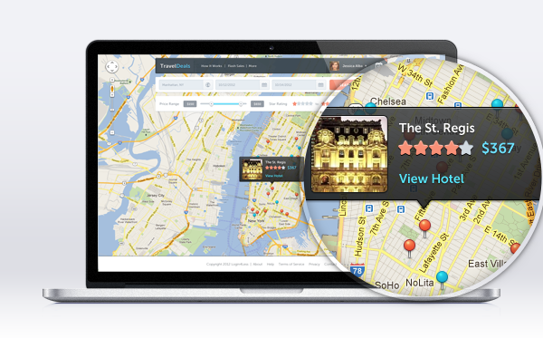
Intuitive checkboxes, easy-to-read prices, budget slicer, and a click-and-zoom map are just a few of the features that make this travel deal website super-easy to get the most out of.
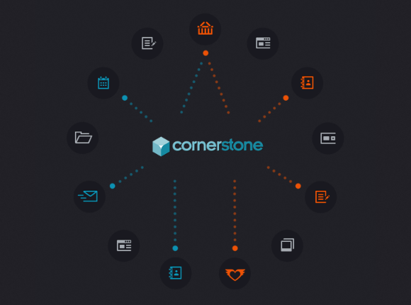
Cornerstone also employs icons to make it easy for users to navigate between features, a trend employed by many current sites today.
I love this design because it visually divides different site sections in an easy-to-understand layout that makes it fun to click.
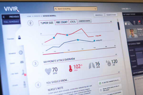
Incredibly, Vivir’s interface offers visual insight into treatment progress for cancer victims. This user interface design makes it easy for doctors to evaluate overall patient health at a glance.
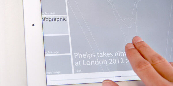
Reuters employed this terrific interface for its coverage of the London Olympics, offering fans a user-friendly way to interact with the games.
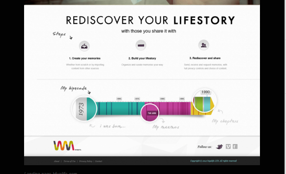
Remember when websites used to load the left sidebar with a never-ending list of options? That’s all in the past, and Hiyalife’s minimalist UI proves it.
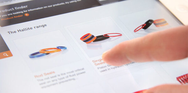
A great UI just beautiful, it’s also functional. The Fenner product finder makes it easy for customers to drill down through the company’s large inventory.
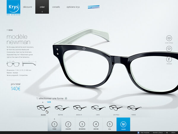
A visually presented five-step process makes it simple for anyone to get the perfect pair of custom eyewear.
This UI design employs contrasting colors, an easy-to-follow grid, and icons to present a lot of information in an easily-readable manner.
