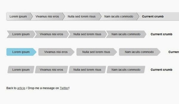
Breadcrumb navigation offers you a visually tempting ways tell the user that where they are actually located on the website. It improves the usability of website and especially of those websites that needs to be structured and organized well in a hierarchical order.
Here, you will find some of the best breadcrumbs to enhance the web applications.
Why to use breadcrumbs?
There are too many reasons to use breadcrumbs and one of the best reasons is that using breadcrumbs allow the user to navigate freely on a website. They can track their own location and see to it that where they are actually located. They are attractive and eye catching. They are smoother to operate and easy to use.
When we need breadcrumbs?
We need breadcrumbs in following situations:
- When your users enter to any internal page of your website
- When you look for integration of secondary navigation to an element of your site
- When site thrives on the hierarchical structure
- When you have some pages that are nested deep into the website
- When you want user to track their location on the site
Benefits of using Breadcrumbs
Some of the best benefits of using breadcrumbs are:
- Convenient to user: They provide the user with secondary means of navigating the site. User can easily navigate to the higher levels of the categories easily.
- Reduces actions to return to Main page: You need not to use the back button in browser to return to higher level of page on the site.
- Does not dominate screen space: These are plainly styled and horizontally oriented, so they have negligible negative impact on content overloading.
- Reduces Bounce Rate: It is a great way to make visitor stay on website for long thus reducing the bounce rate of site.
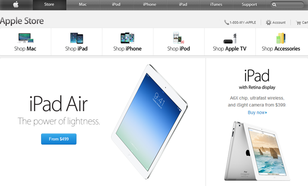
Apple Store
The Apple Store had used the breadcrumbs in an impressive manner. These are designed just like stylized buttons that is well fitted with website’s theme.
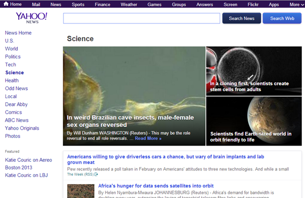
Yahoo! TV
Yahoo had made an interactive button similar to breadcrumbs on this web page. You can browse through the categories located above the search box directly by clicking on them. The inverted triangle breadcrumb style had been changed.
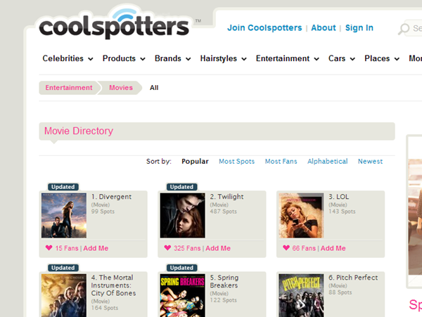
Coolspotters
It has got a simple button like breadcrumb trail matching greatly with website theme. Each button has an inverted triangle, which when clicked helps you to navigate through sub categories.
Nestle
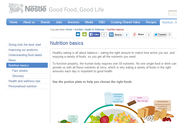
It uses clean and simple breadcrumb, which is the blend it with attractive theme. These breadcrumbs are arranged well in form of the flat text links that is separated by (>) greater than symbol.
Ideo
It has presented its breadcrumb trail in an easy outlook. It consists of stylize text breadcrumbs separated with “>>” which perfectly match up with the theme and make it easy to navigate. It also allows the user to locate him on the site.
Delicious
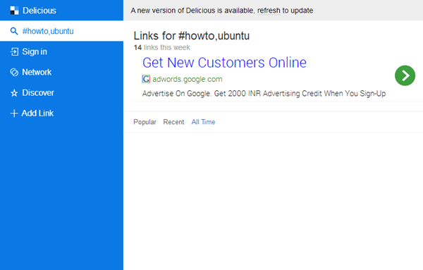
This website had presented its breadcrumb trail of keywords in an interactive way. The breadcrumbs used by delicious are created in different style. Once you click on a category on menu bar, the categories on right of it shift more right, and the list under the clicked category appears below it.
Guardian.co.uk
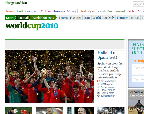
The simplicity of breadcrumbs used by this website is colorful. The categories are divided by a line in between them. When you move the cursor over a category, the category box is filled with some color.
Crooked Tongues
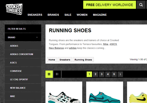
The breadcrumb trail of this website has been changed a little. Now every category is placed in box to make is easy for the user to browse through them.
Nasa
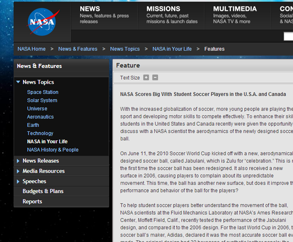
This website is using the breadcrumb trail in very simple but interactive manner. Breadcrumbs are placed in the form of horizontal text form. And the color of the breadcrumbs perfectly suits the website’s color scheme.
WowHead
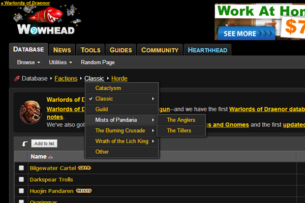
In this websites, designers use the breadcrumbs with drop-down menu list which shows categories, sub-categories and so on. Visitors can easily navigation through the website with these breadcrumbs.

